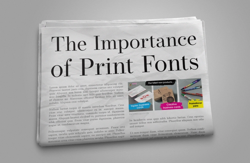
Your font choice can often be overlooked, however they are fundamental in creating reader-friendly marketing materials, and are a major aspect of conveying your message to your clients.
There are millions of font types out there, and the possibilities may seem endless, however each font has its own unique characteristics which will influence your business’ impression on customers.
By using clear, easy to read print fonts, you’ll ensure your marketing material is reader friendly therefore unobtrusive print fonts will minimise the risk of text becoming an eyesore. The consistent use of a specific print font throughout the entirety of a business’ marketing efforts will achieve a consistent brand experience across all channels.
Aesthetically pleasing print fonts can hold the attention of your market and liven up large pieces of mundane text, which can establish an informational hierarchy as your customers can differentiate sections within the text.
Let’s break it down into four main categories:
Serif
Often used in formal contexts, Serif is the most widely used print font type. It is easy to read with physical products, on both matt and shiny surfaces. With recognizable projection at the end of each stroke of each letter, standard serif fonts include Times New Roman and Georgia, however there are many new twists on the serif layout.
Sans Serif
The words “Sans Serif” literally mean without feet, which is a good description of sans-serif fonts. Often more rounded with a contemporary look and feel, sans-serif fonts are frequently used within technology as body text as they’re easier on the eye from a screen. Standard Sans-Serif fonts include Arial and Helvetica.
Script
Script fonts intend to resemble calligraphy, and thus is not a popular choice within print as it can be hard to read. It is used very sparingly by professional companies, though can be tasteful in small areas. Script fonts include Lucida and French Script.
Decorative
Decorative fonts don’t really fit into any of the above, as they can vary massively. Often intended as headings, these fonts can be hard to read but can strongly identify the characteristics of the company using them. A good example would be the Walt Disney font.
And just a friendly and helpful reminder as we’re talking fonts… there is never a good reason or use for ‘comic Sans’ …! Which seems to be a very disliked font for something that is so frequently used!